Regency Medical ClinicWebsite design directions · October 2026

Website design directions

We’ve put together three different visual directions for a new Regency Medical Clinic website. Each one is a working page built from your logo, your own photographs and the information on your current website, so you can open it and click through it like a real site.

These are design concepts rather than finished websites, so some content will be finalised later. Have a look at each one on a computer and on your phone, and tell us which feels most like your practice. You’re also welcome to mix and match: the look of one, say, with the doctors’ page of another.

The three directions

Same information in each, so you are comparing the design.

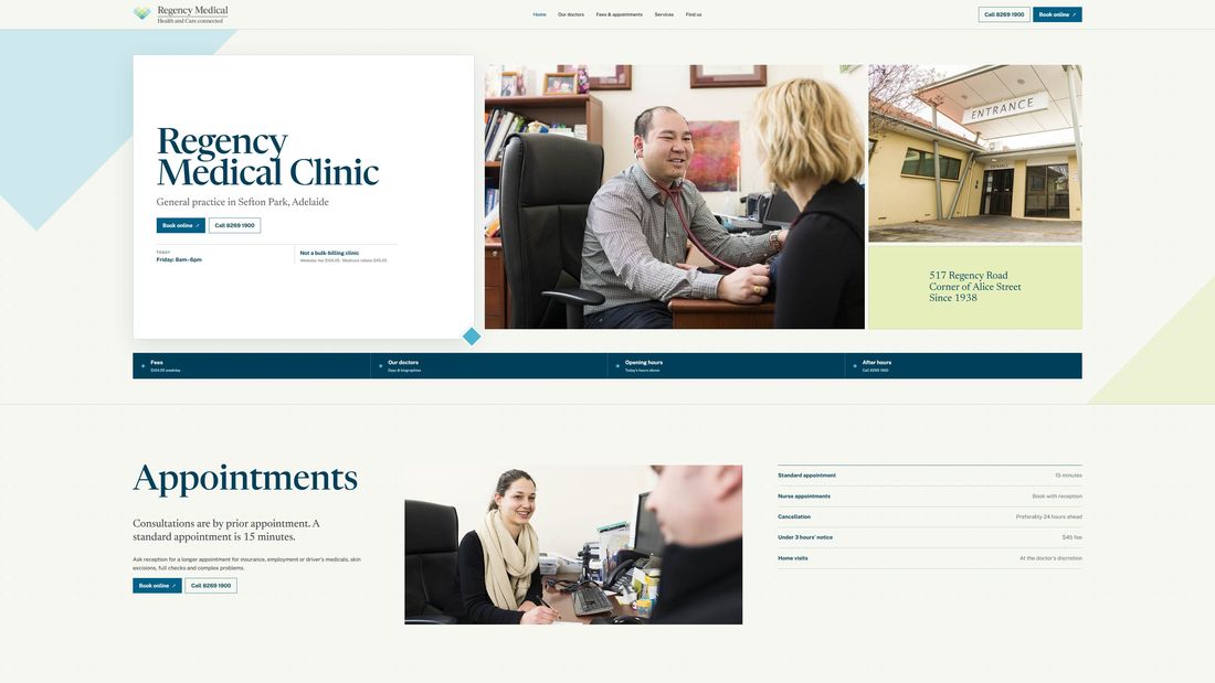
Option A, Navy and photographs: the first screen on a laptopOption A on a phone

Option A

Navy and photographs

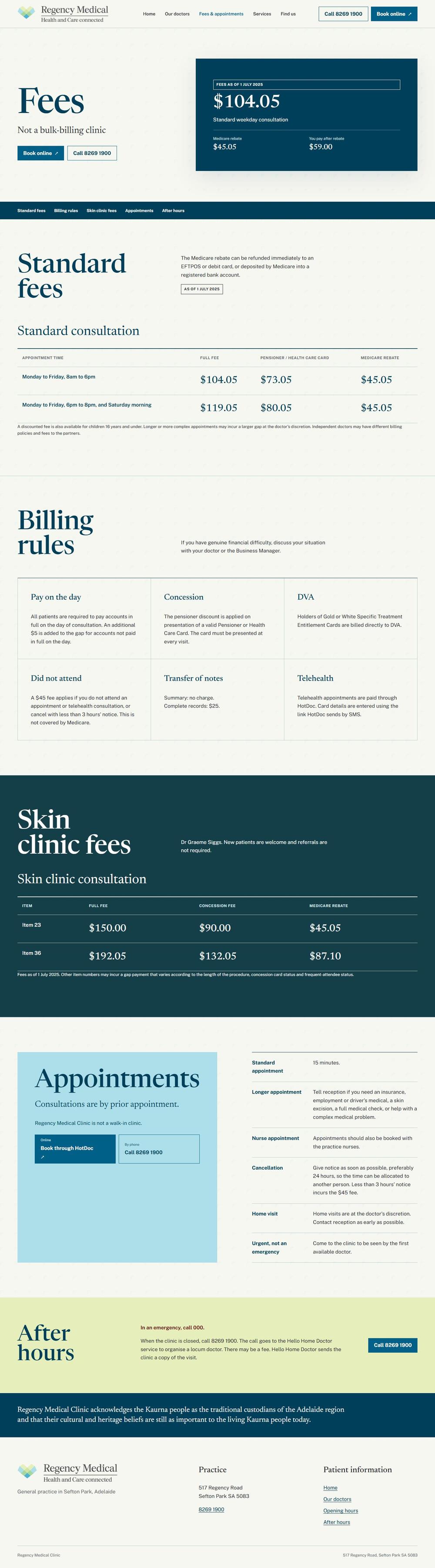
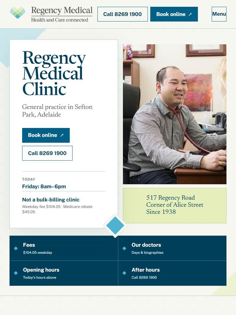
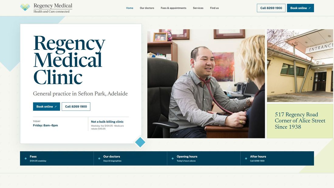
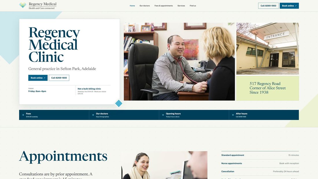
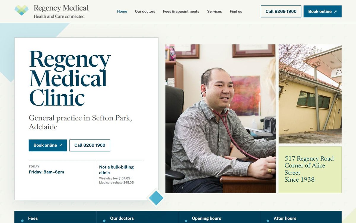
A classic serif in deep navy, your own photographs arranged as a collage on the first screen, and the logo's diamonds used as small markers. Fees and doctors' days set out like a well-kept register.

  • Your clinic photographs carry the first screen
  • A serif typeface that feels established, in keeping with a practice founded in 1938
  • Today's hours and the weekday fee visible straight away
  • Doctors' consulting days shown for every doctor
Open the websiteOur doctorsFees

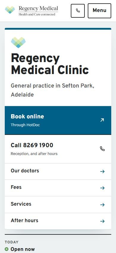
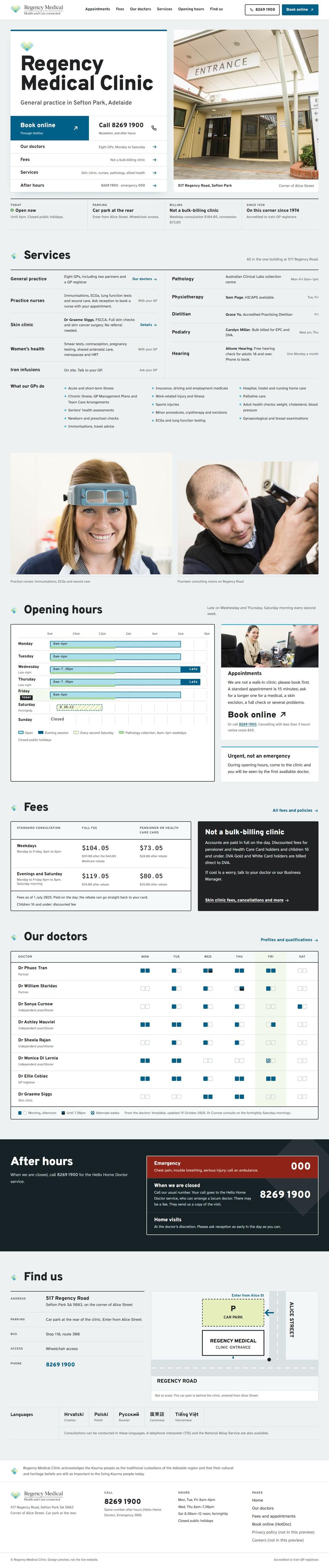
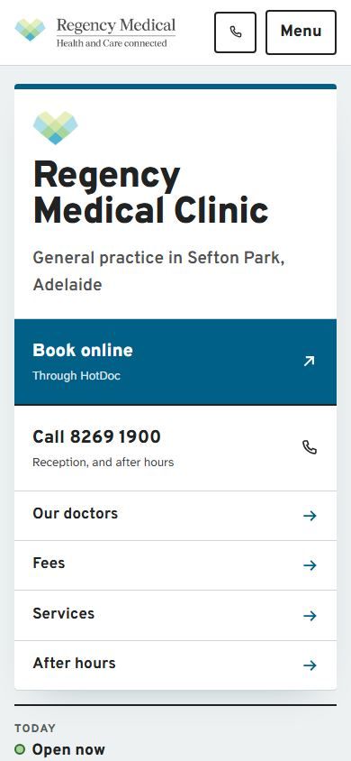
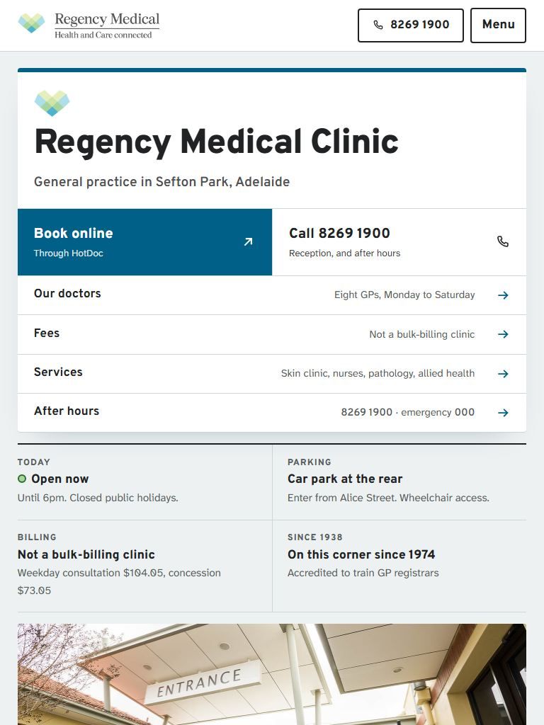
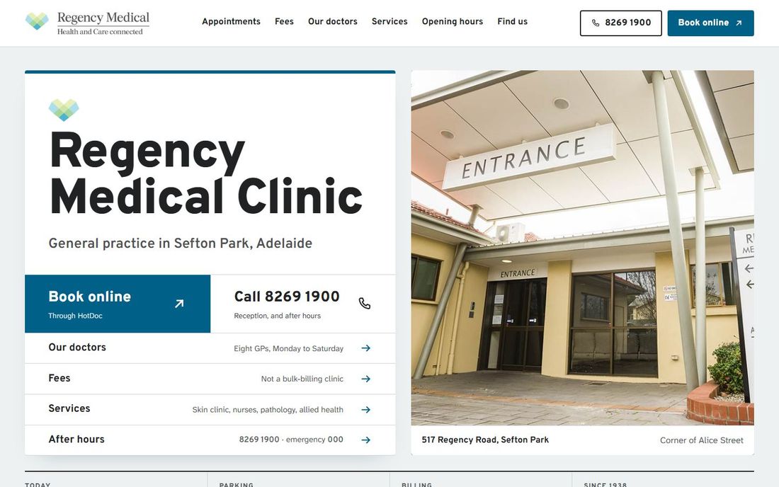
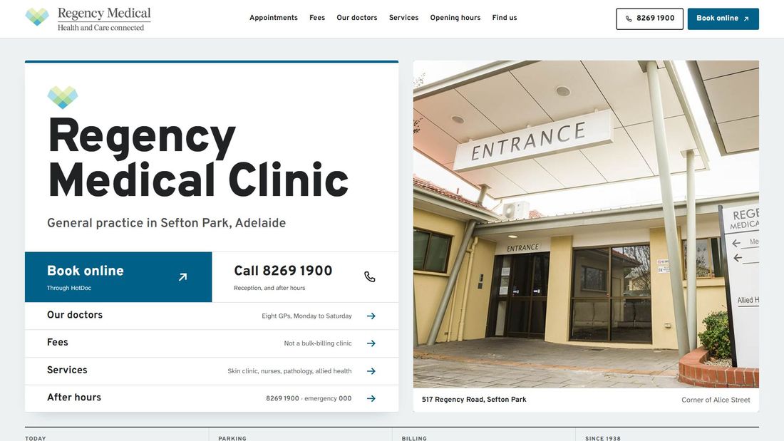
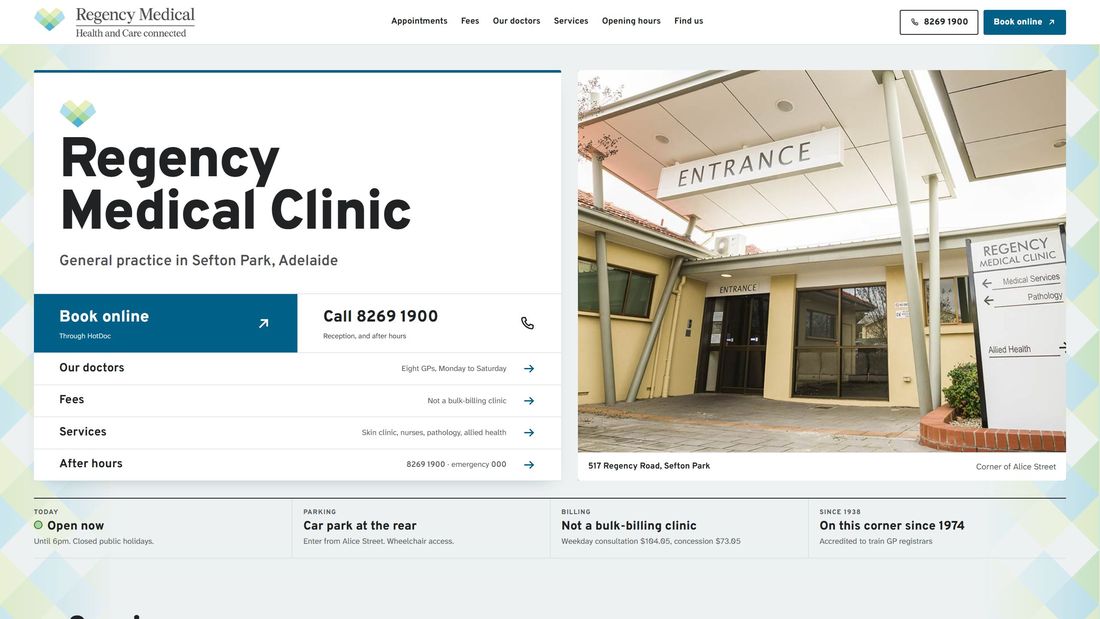
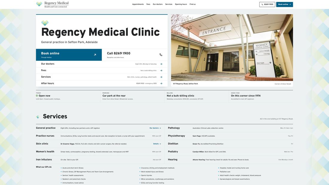
Option B, Signage and timetables: the first screen on a laptopOption B on a phone

Option B

Signage and timetables

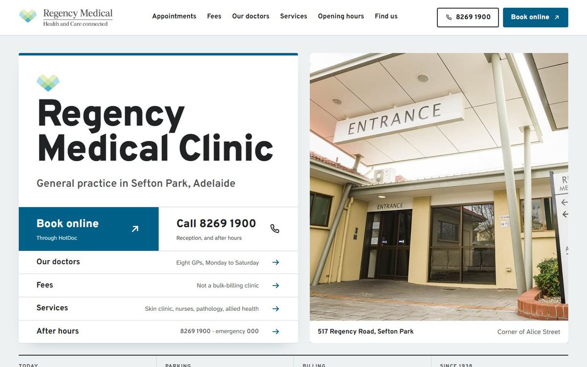
Built from the sign at your entrance: bold, highly legible lettering, white panels and arrows. Opening hours are drawn as a week timeline, and the doctors' days as a simple chart.

  • Large, plain lettering chosen for older eyes
  • Book, call, fees and after hours answered on the first screen
  • A fee panel that shows what is left to pay after the Medicare rebate
  • On a phone, each doctor's days are written out in words

Open the websiteOur doctorsFees

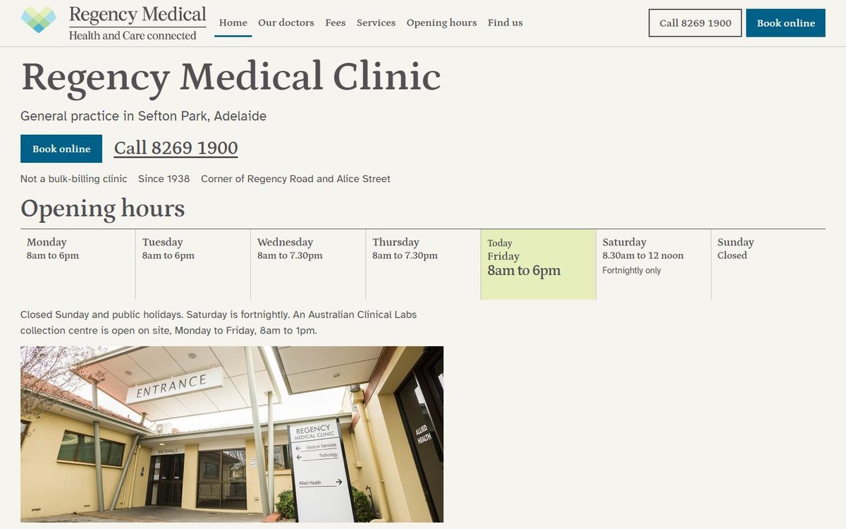
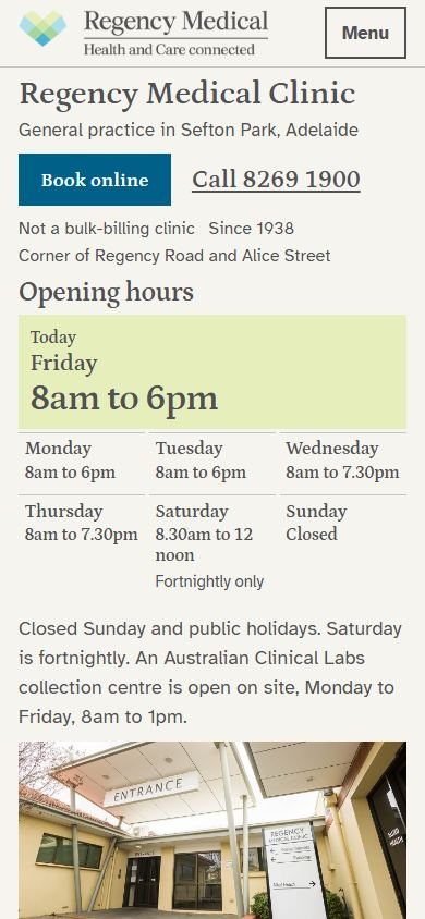
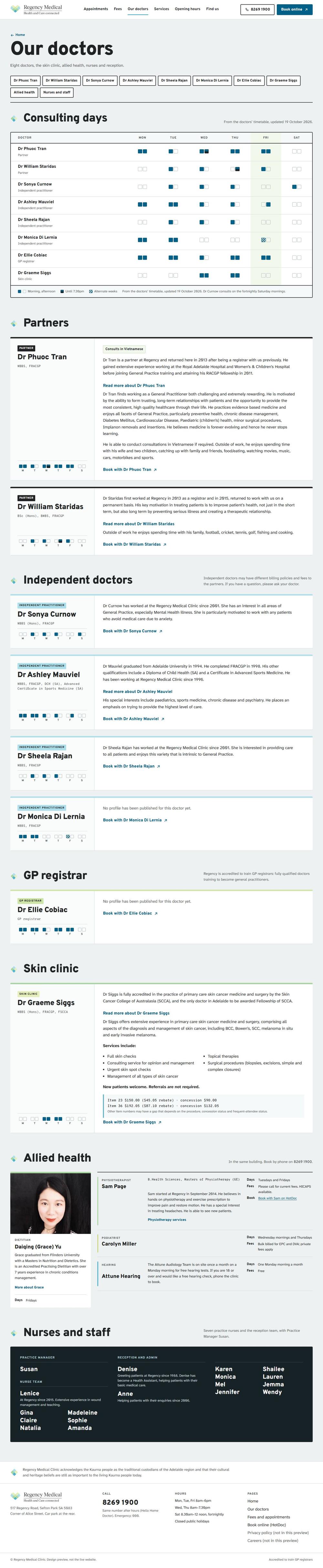
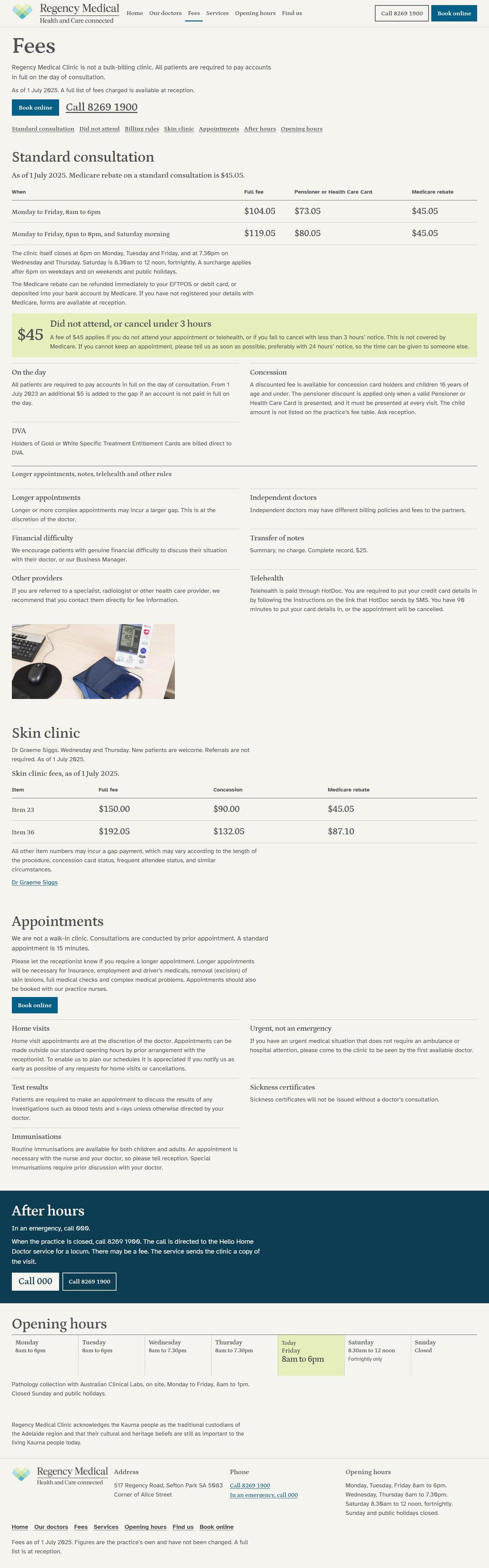
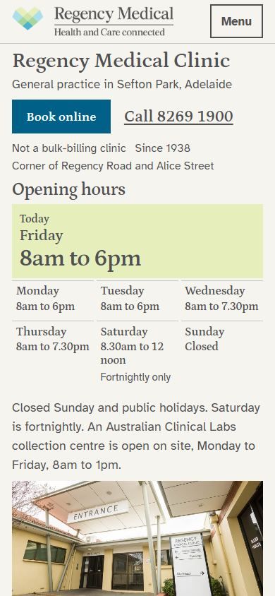
Option C, Quiet and text-led: the first screen on a laptopOption C on a phone

Option C

Quiet and text-led

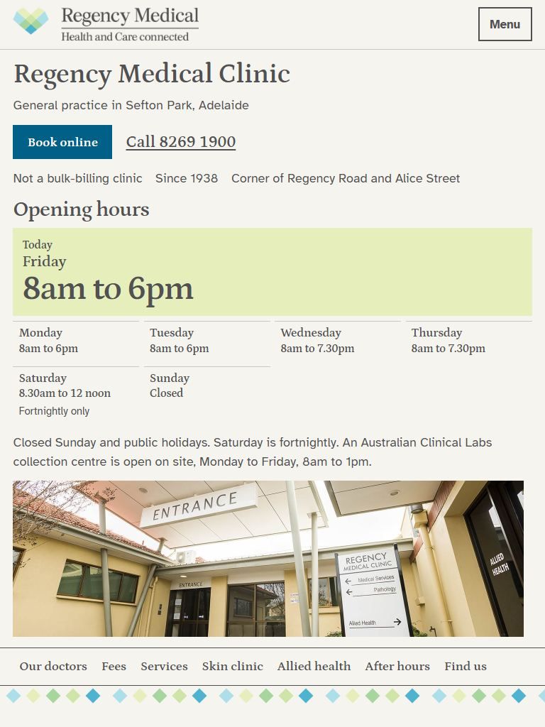
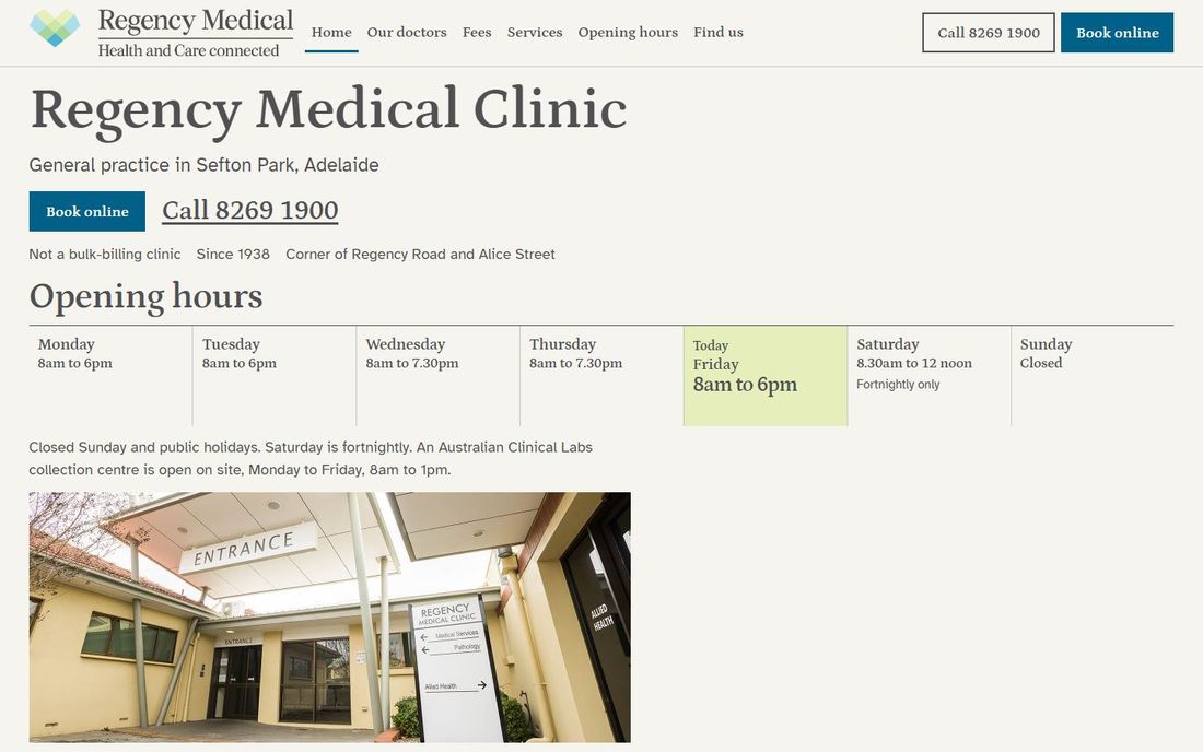
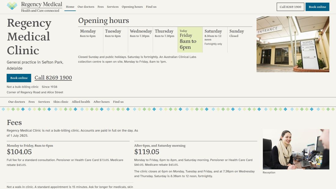
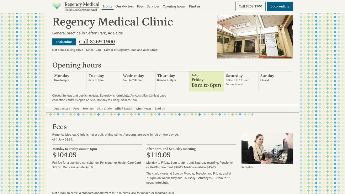
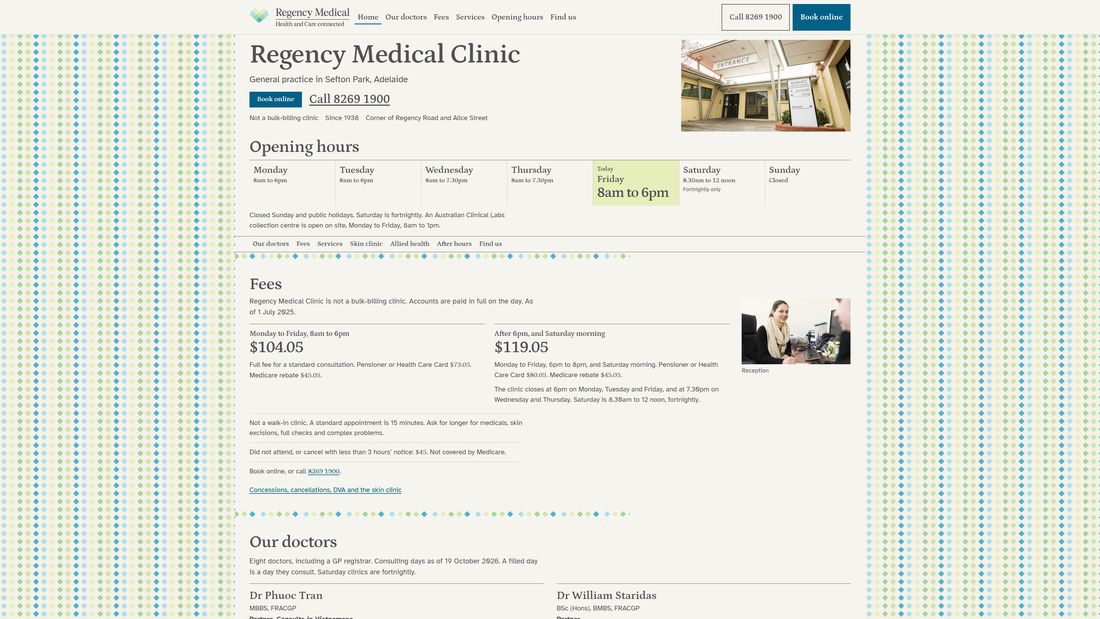
Calm and understated, like a well-kept reception book: a gentle serif for headings, very clear figures for hours and fees, and a thin thread of the logo's diamonds as the only decoration.

  • Today's hours are the biggest thing on the page
  • The least decoration of the three, and the plainest to read
  • Everything on one long, orderly home page
  • The weekday and evening fees set large

Open the websiteOur doctorsFees

Your website today

What we found when we looked at regencyclinic.com.au on 30 October 2026, on a phone, a tablet, a laptop and large monitors.

Your current website: every page is showing an error right now

Every page is showing an error right now

All 20 pages on regencyclinic.com.au currently answer with a server error, and each one ends with “There has been a critical error on this website.” in place of the footer. Search engines and patients see the same thing. We checked every page on 30 October 2026.

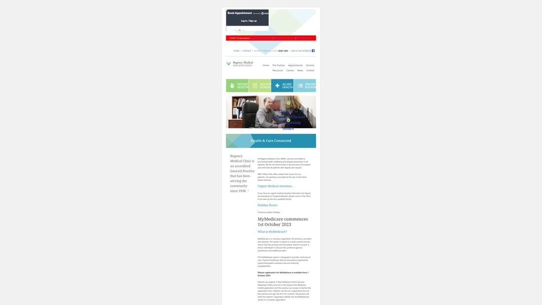
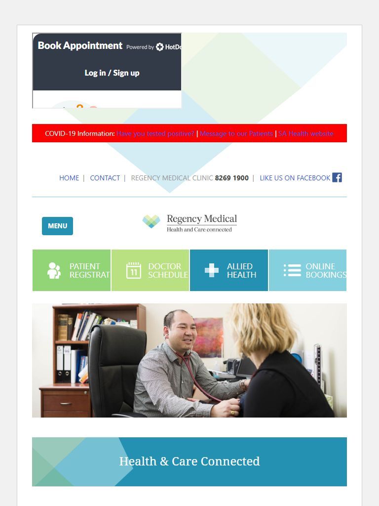
Your current website: on a phone, the first screen has no phone number and no hours

On a phone, the first screen has no phone number and no hours

A booking login box sits over the top of the page, followed by a red COVID-19 bar and the menu button. A patient has to scroll to find the clinic’s phone number or whether it is open today.

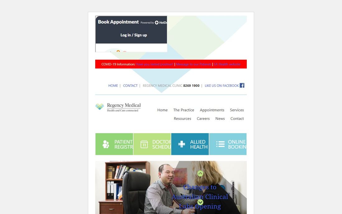
Your current website: the main buttons are cut off

The main buttons are cut off

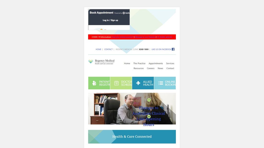
The four coloured buttons under the menu read “PATIENT REGISTR”, “DOCTOR SCHEDU” and “ONLINE BOOKIN” on a laptop, because the words do not fit the boxes.

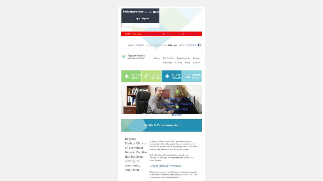
Your current website: on a large screen the site is a narrow strip

On a large screen the site is a narrow strip

The site is 638 pixels wide at every screen size. On a 4K monitor that is a sixth of the screen; on a 2560 monitor, a quarter. Everything else is empty.

Out-of-date information is still published

The COVID-19 bar is still there. The main home-page text announces MyMedicare “commences 1st October 2023”. A 2016 notice about the Zostavax shingles vaccine is still up. The home-page slider still features Dr Stephen and Dr Sanja Klaric, who finished in June 2026. News posts and the About page still refer to the Northfield and Prospect branches, which closed in 2018 and 2022, and the practice brochure linked from the site is from February 2021.

Some details disagree with each other

Dr Rajan’s profile gives different days from the October 2026 timetable. Dr Di Lernia is spelt two ways. Your HotDoc listing includes Dr John Au, who does not appear on the website. The Contact page has an “Opening Hours” heading with nothing under it, and the doctors’ timetable is only available as a PDF.

Patient privacy

Each visit to the home page contacts 11 other websites, including Google Maps, an analytics service and an error-reporting service, before the visitor has done anything. The site also publishes a fax number. We recommend patients reach the clinic by phone or online booking only, so nobody sends health information by fax or email.


Search and accessibility

The home page has no description for Google, its main heading is “Health & Care Connected” rather than the clinic’s name, and two of its three images have no description for people using screen readers.

Your current home page on six screen sizes

Your current home page on a phone
Phone
Your current home page on a tablet
Tablet
Your current home page on a laptop
Laptop
Your current home page on a desktop
Desktop
Your current home page on a large monitor
Large monitor
Your current home page on a 4k monitor
4K monitor

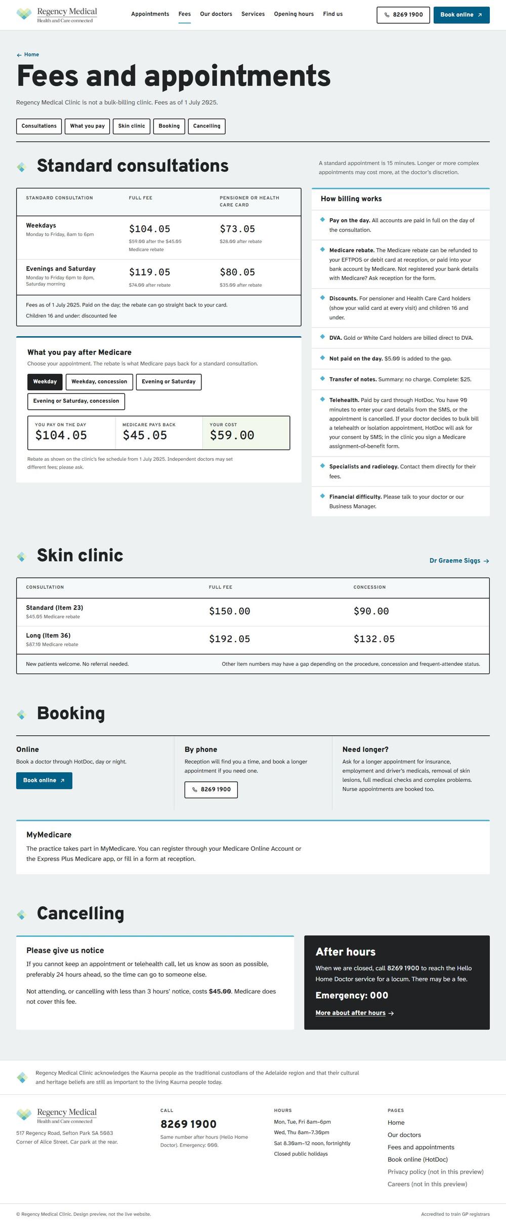
Option A

Navy and photographs

A classic serif in deep navy, your own photographs arranged as a collage on the first screen, and the logo's diamonds used as small markers. Fees and doctors' days set out like a well-kept register.

Open the websiteOur doctorsFees

Every page, full length. Scroll inside each frame.

Option A, Home page, full length, laptop
Home, laptop
Option A, Home page, full length, phone
Home, phone
Option A, Our doctors page, full length, laptop
Our doctors, laptop
Option A, Our doctors page, full length, phone
Our doctors, phone
Option A, Fees page, full length, laptop
Fees, laptop
Option A, Fees page, full length, phone
Fees, phone

On every screen size

Option A on a phone
Phone
Option A on a tablet
Tablet
Option A on a laptop
Laptop
Option A on a desktop
Desktop
Option A on a large monitor
Large monitor
Option A on a 4k monitor
4K monitor

Option B

Signage and timetables

Built from the sign at your entrance: bold, highly legible lettering, white panels and arrows. Opening hours are drawn as a week timeline, and the doctors' days as a simple chart.

Open the websiteOur doctorsFees

Every page, full length. Scroll inside each frame.

Option B, Home page, full length, laptop
Home, laptop
Option B, Home page, full length, phone
Home, phone
Option B, Our doctors page, full length, laptop
Our doctors, laptop
Option B, Our doctors page, full length, phone
Our doctors, phone
Option B, Fees page, full length, laptop
Fees, laptop
Option B, Fees page, full length, phone
Fees, phone

On every screen size

Option B on a phone
Phone
Option B on a tablet
Tablet
Option B on a laptop
Laptop
Option B on a desktop
Desktop
Option B on a large monitor
Large monitor
Option B on a 4k monitor
4K monitor

Option C

Quiet and text-led

Calm and understated, like a well-kept reception book: a gentle serif for headings, very clear figures for hours and fees, and a thin thread of the logo's diamonds as the only decoration.

Open the websiteOur doctorsFees

Every page, full length. Scroll inside each frame.

Option C, Home page, full length, laptop
Home, laptop
Option C, Home page, full length, phone
Home, phone
Option C, Our doctors page, full length, laptop
Our doctors, laptop
Option C, Our doctors page, full length, phone
Our doctors, phone
Option C, Fees page, full length, laptop
Fees, laptop
Option C, Fees page, full length, phone
Fees, phone

On every screen size

Option C on a phone
Phone
Option C on a tablet
Tablet
Option C on a laptop
Laptop
Option C on a desktop
Desktop
Option C on a large monitor
Large monitor
Option C on a 4k monitor
4K monitor

Tell us what you think

Choose the direction that best represents the clinic and feels comfortable for your patients. Don’t worry about final wording, missing details or photographs: those are settled after a direction is chosen.

  • Which feels most like Regency?
  • How easy is it to find doctors, fees, booking, hours and the phone number?
  • Look at the phone version and the inside pages, not just the first screen.
  • If another option does one section better, tell us which.

Nothing on these pages changes your current website, and nothing here is sent anywhere. Final text, photographs and fees will all be checked with you before anything goes live.

Your feedback

Which direction feels most like your practice?
Anything you’d borrow from another option?

This copies your answers so you can paste them into a reply to our email. Nothing is sent from this page.